Archives

3 Poster Brief - Influence.

Wim Crouwel.

Wim Crouwel.

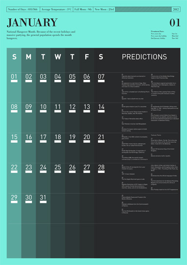
For this brief I'm interested in the structured graphical style of contemporary graphic design and info graphics. These calendars are both valid to my proverb and provide some good compositional concepts. I like the simplicity and delicacy of the line when positioned with the denser numbering.


Again this example by Tim Wan is not only bold but manages to be delicate. It's structure doesn't take away from it's creativity and that's a balance I'd like to try and achieve on this brief.


Gilad Shalit

Another interesting example focusing on time.

Proverb Task Research.

I think what interest's me most with this idea of tomorrow is another day is how there is always another tomorrow. It's a term which could apply to anyone in the world at any period of the human race. This concept of tomorrow being this infinite man made premise which will only end when we as humans end.

Ouroboros - Ancient symbol depicting serpent biting it's own tail thus creating a cycle.
The Infinite Loop - No beginning. No end.
The cycle will always continue just as however long you live there will always be another tomorrow and another chance to do things differently. Even considering the daily loops we are bound to such as food, water and sleep.


Tomorrow is Another Day ...

I have been given the task to create 3 posters based on the proverb 'Tomorrow is Another Day'.

ORIGIN
First put as 'Tomorrow is a New Day' in 1520.
Last line of American Civil War Novel 'Gone With The Wind'. 
"After All, Tomorrow Is Another Day".

Whatever hasn't been accomplished today is given another chance tomorrow.

It comes with connotations of time, chance and hope. It could also be seen in a negative light in forms of regret as a reaction to something going wrong. Even seen with this negative cast however it still can't help to be seen as a shimmer of hope and contemplation. Similar to other sayings such as when you fall off the horse you get back on or when you get knocked down you pick yourself back up again. It suggests second chances in the face of defeat.

Lecture Notes 1 - Modernity & Modernism

Art critique and patron John Ruskin (1819 - 1900) classed painters of his generations as 'Modern' such as the pre-raphaelite brotherhood.


Modern perceived as progressive and radical. The 'NEW'. Vital to the progression of fashion.

Paris Exposition (1855) showed the pinacles of 'modern' art, design and technology in the city which was viewed as the most modern city in the world.

This shift from old to new was brought about from Urbanisation. Technological discovery's led to a move from the rural to the industrial. Transport links, Telephone lines, New forms of global entertainment etc resulting in the world effectively getting smaller resulting in new ways of looking at the world obviously influencing art and design.

Cities like london and paris struggling in efforts to be regarded as the most modern.

Also classed as a period of enlightenment as notions changed from religion and superstition to science and reason.

The city became the beacon for all things modern.

Modern design such as the eiffel tower radicalised things by using modern materials and vast scale.


World time was established, again uniting a world which was once distant.

Paris went through a period known as 'Haussmannisation'. The old Paris centre which was dirty and poor was ripped out/flattened and re-thought by a designer named Haussmann. It became awash with large boulevards that allowed easier access to the city by the army and police therefore making the people easier to control. This also brought about a shift from the centre being working class to upper class and bringing about further class separation.


Georges-Eugène Haussmann


Growth of psychology in the late 18th Century as they try to break down the effects these drastic changes are having on peoples minds.

Art, Culture and Technology merge. 

Technology forces artists and designers to view the world and people differently.

The mass society layout's of cities brings about greater differences between people as faceless anonymous tendencies creep in. 

This technology inspires new artistic techniques. 

Paintings begin to experiment with cropping due to inspiration from the budding medium of photography.

Kaiserpanorama (1883)
Technology becomes a barrier between direct human interaction. 

Creates anti-modernists such as Max Nordau who are against this shift in society.

MODERNISM - Emerges out of the experiences artists and designers are having with this modern society - Modernity.

Photography again makes painters experiment away from realism due to photography being the ultimate form of this. 

Modernist icon art school the Bauhaus opens. Fully flexing it's modernist views into every aspect of art and design.
-Anti-Historicism
-Truth To Materials.
-Form Follows Function.
-Technology.
-International.


Bauhaus - Modernist Art School and Building.

"Ornament is Crime" - Adolf Loo's
- Simple effective design will always stay in fashion no matter how much to trends change.

Sans Serif typefaces were created by Herbert Bayer to get rid of unnecessary ornament on type. However serif fonts being created at the same time such as 'Times New Roman' by Stanley Morrison.

Mass production was leveling out the differences in class allowing cheap affordable design for everyone. 

Material's.
-Concrete.
-Plastics.
-Steel.
-Aluminium.
-Reinforced Glass.

CONCLUSION

MODERNITY (1750 - 1960) - Social and Cultural experience.

MODERNISE - The range of styles that sprang from modernity. 


Context Of Practice Image Analysis.


The Uncle Sam Range (1876) - Image 1
Poster by Savile Lumley (1915) - Image 2

I have been asked to compare two image which on the surface may appear to have many differences but in reality share several similarities even taking into account their message, time of production and nationality. 

Both use traditional illustrative methods to put across the desired message. This gave the artist and designers complete creative control over composition and content matter. These were the days when photography would have been expensive and people could still relate more to a piece of hand rendered advertising or promotional material. Images like the 'Uncle Sam Range' which depict fantasy and symbolism suit this method for obvious reasons.

We can see how the choice of lettering and font colour have been pondered upon in order to further back up their desired message. The slab woodblock style text in image 1 is generally associated with the wild west and the frontier, american prestige. It symbolises in many ways the land of the brave, the west and everything that brought with it. Freedom, opportunity and of course gold which therefore is an obvious choice for the text colour. It's big, unashamedly bold and undisputedly american. Compare this to image 2 and it's a very different affair. The tone is homely and subtle leaving the impression you are being asked the question. It's curls and even the choice to make it italic make it seem far more innocent than the subject matter actually is.

The subject matter in both images is thrown at you in every sense of the piece and both play heavily on symbolism and patriotism. The national symbols are thrust upon you in almost sickening measures within image 1 as opposed to image 2 where they are designed to be a little bit subtler.

Looking deeper into the meaning of the images however we see they portray very different messages. Image 1 is designed to appeal to american males in an era of fruition and national pride. 100 years on from the american revolution and uncle sam has the world over for dinner cooking them their favourite foods (or slightly offensive racial stereotypes of what their favourite foods were) all on the pinacle of culinary cremation, the all american and therefore all superior uncle sam range cooker. Every drop of patriotism is squeezed out here, bald eagles clash with the gluttonous use of stars and stripes draped from floor to ceiling as uncle sam and his young strapping boys (the east, the west and the south) are fed by the 'woman' and the negro slave, both signs of power and wealth.

On the other hand we have an image again aimed at males but for a much different cause. 1915 tells us that world war 1 had begun and this was a time before mandatory conscription meaning the army needed men and what better way then to guilt them into it? The scene depicts a father perched upon his armchair, children at his feet whilst his daughter poses the question, 'Daddy, what did YOU do in the Great War? We already know that the war is long from over at this point so therefore the artist is playing on what is supposed to be a post-war contemplation as he gazes into the viewers eyes and ponders his cowardice and how he let not only his children but his country down. Obviously the viewer is supposed to relate to this gentleman and question his own morality, hopefully skipping down to the recruitment station to sign along the dotted line for a gun and an imposing expiry date. As I said earlier we also see national symbols peppered across the scenery but this time of a more british inclination. Red roses and royal fleur de les replace stars and stripes as we are given the sense that you are fighting for more than yourself but for country and queen and positively in-forces the fact that in the end, we will win.    

Interview Results


Me and seb both decided after having a stab at the questionnaire that the results didn't give us the direction we were after. Instead we decided to just chat and find something more malleable. We started to discuss our artistic tastes and that gave us much better words to be able to begin designing a typeface around.

'ABSTRACT' - Typographic Inspiration

I am intrigued by the word abstract and the subsequent words that followed it. It could give me a great basis to work from when designing a typeface. It's also something I have never experimented in great detail with. Could definitely be a challenge. No pain no gain!


Cutting away from letter forms but still maintaining their legibility could bring an interesting element to a type face. I need to figure out a way to push away from the norm. 

------------------------------------------------------------------------------------------------------------------------------------

I was more interested in the letters formed during the transformation in this animation. As it morph's into the next letter/number it creates some interesting variations on the original. 


Viga Font - Fermin Guerrero

Looks like it was drawn on an isometric plane. It definitely uses a form of grid as the base of inspiration.

------------------------------------------------------------------------------------------------------------------------------------


Funnily enough this image is 'stretch' which is the word I was given for the previous task. The above two are much more abstract and seem far less concerned about any legibility issues it may have. This may not be a bad thing though when tackling the word abstract. Legibility should maybe not be my priority concern as it may stifle the creativity and the word abstract in it's purest forms try's to break away from general rule.


Bloob by Erik Erdokozi.


Tri-Face Font - Sean A. Metcalf

Keeping in mind the breakdown of abstract and the words shape and form I came across this angular typeface. I'd like to experiment with shapes and filled block areas in my visual work. I particularly like the triangle pattern above which can either be seen as a collection of black triangles or negative space made from triangles in a black square. 


5 Words.

SEB NEEDLER.


- ABSTRACT.
- Minimal, Shapes, Form, Different and Unusual.


- CHILLED.
- Cool, Relaxed, Calm, Balanced and Passive.

- CASUAL.
- Informal, Laid-back, Careless, Indifferent and Unconcerned.

- SKATEBOARDING.
- Concrete, Grind, Flip, Slide and Slam.

- SICK.
- Mint, Ace, Vomit, Hurl and Ill.


Alphabet Soup Brief 2

I've been asked to design a hand rendered typeface based on a partner from the class which has been given at random. My partner is Seb Needler.

I will upload the interview and 5 words exercise we undertook after this overview. 

Obviously not all the question's asked are possible to transpose into a typeface. After talking to seb however I got a feel for some of his interests and passions that might be worth looking into.

- Abstract (his design sense)
- Skateboarding (his hobby)
- Chilled (his personality)


Love / Hate


LOVE

One of my favourite studio's at the moment. Heavily screen print based. They make great use of type, texture and space. Love, can't see it ever changing either.


LOVE 

Faile are primarily street art based but personally I love the combination of type and image in their print posters. Obviously based on old comic book cover compositions but with a modern twist. 


LOVE

I can't actually remember how I found Dan Stiles, I think it was inside an old gig poster book I acquired. Can honestly say I was instantly a fan. His colour choices and compositions are always spot on.

4. Takeaway Menus


HATE

Takeaway menus are generally quite offensive as a designer. More creative pollution than pleasurable. If they didn't hold the key to getting a greasy kebab inside me then I'd wash my hands of them. 

5. Clubbing Promotion


HATE

This is a generalisation as there is a lot of quality designs for dance nights these days. However, if you stroll down the compilations aisle in your local hmv then your bound to be greeted by this. Vile. 
 

Copyright 2010. All rights reserved.

RSS Feed. This blog is proudly powered by Blogger and uses Modern Clix, a theme by Rodrigo Galindez. Modern Clix blogger template by Introblogger.