Archives

OUGD401. Evaluation.

1.  What skills have you developed through this module and how effectively do you think you have applied them?

Academic writing is definitely something that has been fairly new to me. Writing the essay was probably the biggest learning curve and since doing so I feel I am able to analyze in a deeper and thoughtful manner. It has helped me understand harvard referencing and quoting sources correctly within my writing. On the practical side I learnt the importance of gathering relevant and poignant content for any work you plan to do and how to give credits to the authors. 

2. What approaches to/methods of design production have you developed and how have they informed your design development process?

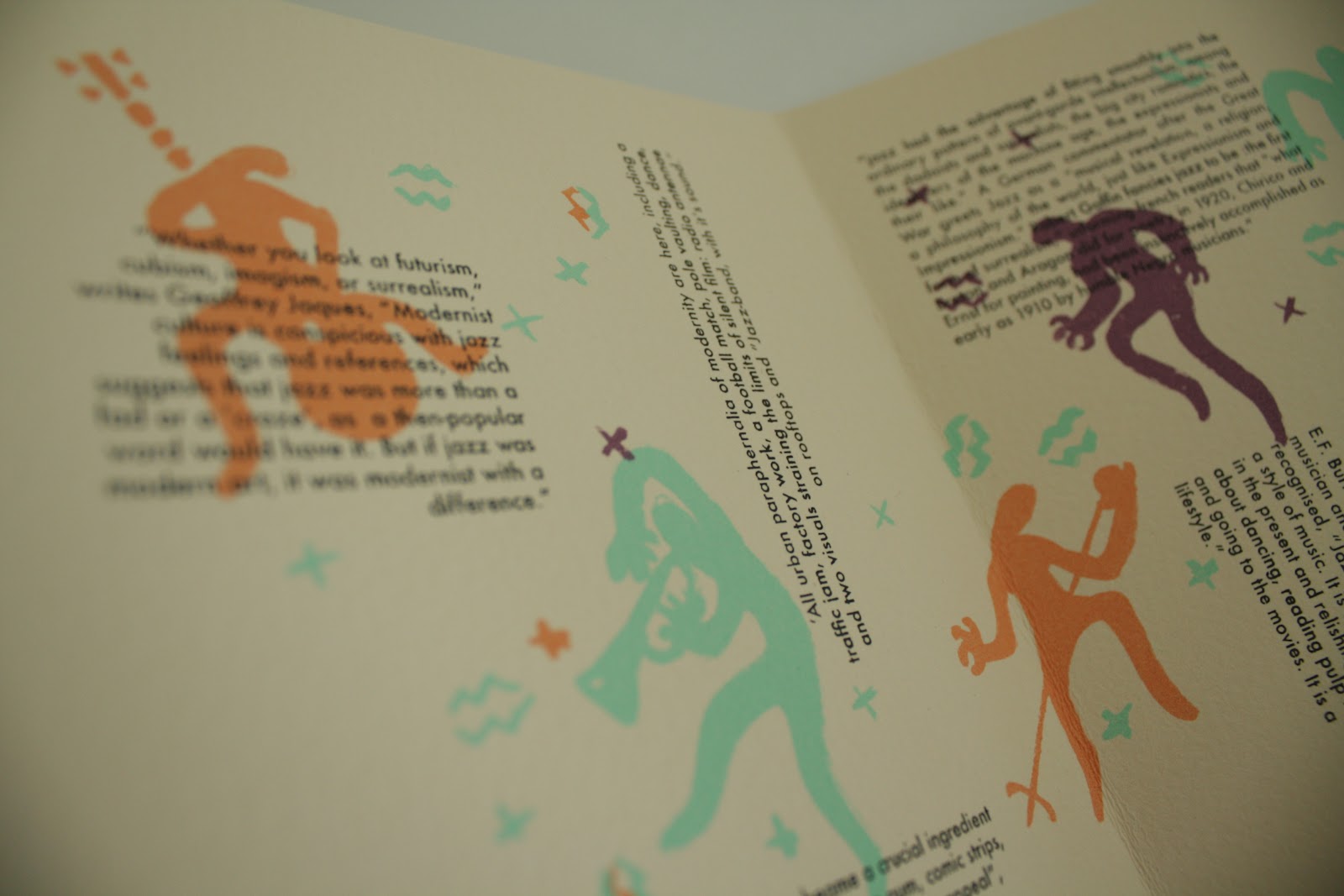
The benefit of knowing your contextual reference so well is that it gives you a strong foundation to build your design decisions upon. Once you know and get a feel for your chosen topic and are aware of the aesthetics and artistic movement which motivated the area then you are basically given a variety of materials to use. For example I wanted to use a bongo skin to print upon for the cover of my publication. This is an immediate link to jazz and music which is an option basically presented to me by looking into the topic. 

3. What strengths can you identify in your work and how have/will you capitalize on these?

My strengths were the format and contextual influence of my publication. Physical design work turned out well. It's given me a mind to enrich my future work by careful consideration of subject matter and how in many ways you can inject and reflect that into the physical form of a publication etc.

In the end my academic writing felt strong and I was pleased with the final essay. Definitely interests me to continue working on this and progressing into the second year contextual studies. 


4. What weaknesses can you identify in your work and how will you address these in future?


A better planning of materials is required when developing design work. It left my final piece looking different then the way I'd planned in terms of format. Also I need to realize that different printing processes take time and need to fit around my college schedule. The foiling and cover design I had planned had to be left out due to bad planning.

Essays need a stronger base of research before beginning to write and I also need to follow a stronger structure when talking about others work in critique. 

5. Identify 5 things that you will do differently next time and what you expect to gain from doing these?


- Give stronger advice in criticism of others work to enrich both theirs and my practice.

- Keep on top of lecture notes and allow time for my own research into the topic. Will give me a better understanding. 

- Experiment with more unusual formats of publication design. Results in more original finals. 

- Use the library more for research. Will give me a broader and more in depth research base to build my practice from. 

- Pay more attention to smaller tasks. I will learn more from them. 


6.How would you grade yourself on the following areas:
(please indicate using an ‘x’) 
 
5= excellent, 4 = very good, 3 = good, 2 = average, 1 = poor   


1
2
3
4
5
Attendance


x

Punctuality


x
Motivation


x


Commitment


x


Quantity of work produced


x


Quality of work produced


x

Contribution to the group


x


Lecture. Social Media.

Looking into and exploring the affects of social media on creative practices.

- New Media - Supposed to be a break from the old which focuses on involvement and engagement instead of persuasion.

Involved a transition from global print campaigns to campaigns which involved the intended viewer interacting with the campaign. Such as websites, games, etc,

Heavily computer based, embracing new technologies to communicate messages.


Shift from MASS to MY media. Much more personalised.

http://en.wikipedia.org/wiki/New_media


Lecture. Communication.

Communication is described in many ways.

It's useful for designers to have a grasp of how a message is communicated effectively and the theory behind it. It's not a straight forward thing and is effected by many scientific and social attributes.


Level 1  Technical  Accuracy
  Systems of encoding and decoding
  Compatibility of systems/need for specialist equipment or knowledge

Level 2  Semantic  Precision of language
  How much of the message can be lost without meaning being lost?
  What language to use?

Level 3  Effectiveness  Does the message affect behaviour the way we want it to?
  What can be done if the required effect fails to happen?

The way a message communicates can be determined by the persons class, employment or marital status, even their level of education. Gender, age and country of origin can also play a role. 

For example someone in Japan may prefer to get their information via the radio then a newspaper due to his social surroundings etc. 

Countries with lower development can be affected by western programming and in turn become more influenced by capitalism and consumerism. 

Semiotics are used to understand this.
We are guided through life by combinations of shapes which we recognize as signs. Even language when written is only a combination of shapes on a page that we can decipher through repeated exposure. 

Images also hold meanings and communicate messages we may not be aware of. For instance a smiling person indicates happiness. A crown would make us think of tradition and royalty, but then again maybe war and knights to another with different social factors.

The context of a picture such as a black and white faded image from the victorian era is vital to giving an image meaning. Without an awareness of it's setting then it becomes just face value and overall holds less value to the viewer. 

Lecture. Media Specificity.

Refers to the media or medium in which something is done. The material of use or artistic expression.

As we evolved we gained the ability to use tools and found new ways to communicate. These specific senses such as sight, sound and smell enable us create specific mediums which cater to such senses.


Media specificity describes how the media used within a specific art form mean certain possibilities and constraints on expression. And the media itself guides and constrains what results are produced.

Media itself and technology shape the way we see and move around the world. It revolutionizes the way we are in socially. From the newspaper to the iPhone.


we use it to extend our memory through photographs, sound recording, video. Things we might of otherwise forgotten can be recorded through the ages.


An example of media specificity is comic books, the way a page is separated to tell the story directly affects the way the artist will create his illustrations, through the guidelines of his media.


Jazz Modernism (CoP Practical). Final.


Here is the results of my process.

Positives:

Turned out nicely in terms of an illustrative process. Contextually it is strong, every element owes it's visual essence to the jazz age. It's slightly random yet structured like jazz. Shows tribute to expressionism and impressionism which was the artistic brother to jazz. Due to it's format it can be seen in many different ways as illustrated in the pictures, again similar to jazz.

Negatives:

Wanted to do so much more with this, had many plans that didn't come to fruition. This is more of a glimpse of an overall vision. Needs more content. Feels as though it's missing something. Some of the illustrations aren't as refined as I wanted but this is the nature of expression.  

Publication. Development.

After I'd decided roughly on a visual aesthetic and content derived from my contextual references I could begin to think about the format and layout of the actual publication. 

Originally I had planned to print these dancing forms on a bongo skin as a cover. Unfortunately the bongo skin I found came in the post a day before printing after the screens had already been set up and when cropped down to the document dimensions was too small. It resulted in the corners being cut which didn't fit right with the feel of the rest of the publication. This meant I had to make some adjustments during printing to allow for this error. 

Once I had my fold out format I could arrange my main content and then illustrate the smaller figures around the text to give me an overall composition.

Typographically I'd already decided on a style of text which had an expressionist feel and was popular around the time of the Jazz boom.  


 Obviously some things change in transition to the final and it's nothing like what I originally had in mind but I feel it shows strong contextual reference and thought resulting in something which visually owes its roots to jazz.

Publication. Experimentation.

I knew from the start that I wanted the publication to feel expressive and I guess you could say 'jazzy'. This meant that it needed that hand rendered element.

Trying to let my own expression come through, it took the form of these Keith Haring/Henri Matisse figures in an almost tribal dance to jazz. I wanted to keep some essence of the Negro roots and culture in there and elements of impressionism and expressionism which I know jazz musicians were inspired by at the time and vice versa. These artistic influences within the time are vital to expressing Jazz in an informed and viable way.

Lecture. Visual Communication.

'The rhetoric of the image'.

Theories of Roland Barthes - approach to understanding images.


If you've not seen this photo then you see it for what it is, literally. Just a photo of young people sat on a sofa. Happy, celebrating maybe, on a night out.
 If you've seen the show then you will automatically see this differently because you know the characters and their backgrounds etc.

Semioticians - Work with semiotics and try to unload meanings with signs and images.

Signifier - What you can see.
Signified - What it suggests.


Denote - Shows a man in front of a building
Connote - Status, power, friendliness.
Uses symbolism to project a message. For example a 'dome' on a building symbolises the architecture of Rome, Rome is power and intelligence.

The culture as in time and the area of an image needs to be known to fully understand an image.

Another example is how a dragon can be seen in very different ways when on a flag, compared to a computer game or a church window.

Can you look at a swastika and not associate it with what it's caused as oppose to it just being a shape.

Lecture. Fashion as Photography.

- Fashion photography serves the purpose of illustrating clothing to a commercial audience.
- Fashion photography takes much inspiration from still life photography in terms of setting, pose and lighting.
 - Ghost Mannequin - We have all experienced this on a website where the item of clothing were looking at appears floating like its worn by a ghost.

Advances in half-tone printing meant photographs could be reproduced in magazines much easier. Before this in the 1900's, these photograph's would of had to of been illustrations.

 
This would mean the start for later magazines such as Vogue which is a globally recognized name in fashion.

Cecil Beaton (1904 - 80) became one the most well known and successful fashion photographers.  He worked will all the big names of the time during his illustrious career. He also designed sets and lighting for broadway shows as well as photographing the Royal Family. 


 Later on we had the emergence of talents such as David Bailey. One of the most well known photographers of any genre of all time. His work was both expressive and com positionally unrivaled.


  Modern day has seen the influence of digital editing and photoshop is applied heavily. This has opened up new realms of possibilities.  
 

Lecture. A History of Advertising.

Lecture covers
- Contexts, advertising strategy, key points in the historical narrative.
- Traces how large-scale colour printing technology developed 19c.
- Integration of art and technology.

- Bill Bernbach (1911 - 1982) was the first advertiser to combine copywriters and art directors.


'Sunlight' - Lever, William Hesketh.
Built Port Sunlight in 19c. Village to house his soap factory workers. Centered around an art gallery. 

  
Colour printing on a larger scale as required by mass advertising was not available until well into the 19c. 

Kellogg's made use of this and was the first to figure out to print, fold and fill cardboard boxes. This created a product with known packaging and most importantly to advertising, a brand which can then be promoted and sold. 

Advertising before mass printing was different. Lever by the 1890's used many fitting contemporary paintings of the time to advertise his soap brand. 


He was the first to extensively advertise and sunlight became a household brand. It was what elevated his product above the rest. 


Levers company 'Unilever' became the biggest in Britain by 1930. 

Newspapers owe much to advertising and most wouldn't be able to exist without it. News of the World ended when the advertisers pulled out due to bad rep. 

Modern creative advertising aims to spread messages in entertaining, engaging and innovative ways. 


Copyright 2010. All rights reserved.

RSS Feed. This blog is proudly powered by Blogger and uses Modern Clix, a theme by Rodrigo Galindez. Modern Clix blogger template by Introblogger.