 |
| Wim Crouwel. |
 |
| Wim Crouwel. |
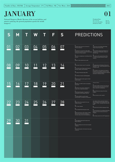
For this brief I'm interested in the structured graphical style of contemporary graphic design and info graphics. These calendars are both valid to my proverb and provide some good compositional concepts. I like the simplicity and delicacy of the line when positioned with the denser numbering.
Again this example by Tim Wan is not only bold but manages to be delicate. It's structure doesn't take away from it's creativity and that's a balance I'd like to try and achieve on this brief.
Gilad Shalit
Another interesting example focusing on time.


Leave your comment