Paul
Rand imparting some of his many years experience within the design
industry. Nice motion graphics too, clean idea to simply animate his work, really brings it to life.
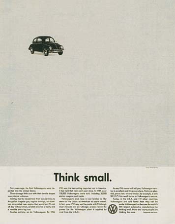
This guy is famous for his work with Volkswagon in the 60's and the kind of style I was thinking of. Simple with a great sense of negative space and atmosphere.
It's brave to use so little elements and for it to work so well. It's clear and unfussy but considered and direct. Clever. I'd like to try and capture this within my posters and focus on not clouding the message with bells and whistles.
Originally when I planned to do the beach illustration I gathered some reference material, things that are iconic of British coastlines. Beach chairs, huts, piers. Due to the timescale I have decided against this concept, I wouldn't of been able to do it justice in the time scale provided and I felt it didn't have that simple clarity the free wash posters have.
Famous for auteurs such as Fellini who made comments on the superficiality of the middle class. Most well known for his work "La Dolce Vita" and "8 1/2".
Cinemas at this time were spilt into
Prima Visione and Seconda Visione.
Terza Visione (rural areas, cheaper).
The Italian working classes at this time would go to the cinema every night much like a social event. They were allowed to talk, drink and eat during the film and could walk in or leave at any point. This made them much more like a television audience then one we'd expect today in modern cinema's.
Filone was a term they used often which was close to the english word 'genre'. This was based on geology, layers within a larger layer.
Some examples of 'Filones' are
'Giallo' - Detective.
Spaghetti Western.
Mondo/Cannibal
'Poliziottesco' - Police.
Spaghetti western is probably the most well known today. These were cowboy films directed by Italians and include films like the "The good, the bad and the ugly" - 1966 (Sergio Leone).
Known for it's specific characteristics
Lack of dialogue.
Use of eye-line and cutting.
Differences in scale.
Use of camera to tell story.
Fragmentation of the body.
Catholic references.
Giallo was Italian for "yellow" like the colour of detective paperback novels of the time. Stylish and expressionistic but challenge 'good taste'. Exploitation movies. Similar to grindhouse in America.
First 'Giallo' was by Mario Bava. "The girl who knew too much".
Based on a private eye who views a murder. Protagonist is usually American or English and visiting Italy. Always a city scape such as Rome or Milan. Never Rural.
Artistic eye again and religious references.
'Giallo' killers also had trademarks.
Black gloves.
Black hat.
Black overcoat.
Disguised gender.
Priests often used as part of gender confusion.
Dario Argento was famous for this 'filone' and was dubbed the Italian Hitchcock. He placed himself as the killers hands whenever they were shot. Visually stunning set pieces shot without sound so films could be dubbed.
"The bird with the crystal plumage". Argento's debut picture.
Cinema saw a period of 'new wave', in britain but more strongly in Paris. A group of French film makers formed the foundations of this, all critiques and all wrote for the Cahiers du Cinema journal which gave Hitchcock his 'auteur' status.
Jean-Luc Goddard.
Francois Truffaut.
Claude Chabrol.
Jaques Rivette.
Eric Rohmer
'La Pointe Courte' (1955) by Agnes Varda. Was the first film to kick off French new wave.
They came about in the 1950's and 60's.
Against the 'cinema of quality'.
discovered American cinema.
cinematic rather than literary focus.
importance of personal expression.
used light-weight cameras and equipment.
faster film stock.
films shot quickly and cheaply.
casual natural look.
used available light and sound.
Mise-en-scene - french landscape.
Rebellion against films shot in the past and in studios. Agaisnt films that were over contrived and over dramatic for entertainment purposes and special effects.
They celebrated American film noir as it reflected modern urban life.
Hitchcock was one of the first truly great film makers and because of such was thought of by many as an 'Auteur'. Auteur was french for author and came from Cahiers du Cinema, a journal. It celebrates the director as an artist in his own right.
Auteurs
like artists.
original work.
creative control.
technical competence.
distinguishable personality.
Hitchcock had a long career starting at the beginning of the film industry. He was innovative and named a master of suspense making his work very influential. He was also technical, even inventing certain camera techniques such as the 'dolly zoom'. Hitchcock played with expressionist lighting, subjective camera and montage/cutting to create tension.
He started in the 1920's by drawing set designs giving him an artistic mind. From there he gained an apprenticeship at 'Gainsbrough' film studios.
In 1927 he made his first film, 'The Lodger'. This is where he first pioneered the dolly zoom or more affectionately referred to by others as the 'Hitchcock' zoom.
He was well known for certain characteristics in his films.
expressionism.
form evokes emotion.
cameo appearance.
narrative often visual over dialogue.
obsessive use of blondes.
uses the same actresses.
Suspense is generated when the audience is anticipating an event, not when it's actually happening. He also was involved with 'voyeurism' and interior meaning.
In 1938 he left Gainsbrough and heading for the states.
Vanderlans, Rudy (2004), 'Graphic Design vs. style, globalism, criticism, science, authenticity and humanism', New York, Princeton Architectual Press. Library ref. 741.601.
Fitzgerald, Kenneth (2010), 'Volume: Writings on Graphic Design, Music, Art and Culture', New York, Princeton Arcitectural Press. Library ref. 741.601.
Carey, John (2005), 'What Good are the Arts?', London, Faber and Faber. Library ref. 701.1.
Freeland, Cynthia (2001), 'But is it Art?', Oxford, Oxford University Press. Library ref. 701.1.
I took a look at existing solutions and images around rain to try and gain inspiration and also to see what the common trends are. The answer. Brollies. A lot of the images I found used the umbrella pictogram as a way of showing rain. It looks nice don't get me wrong but by the looks of it another umbrella based image isn't exactly going to set the world on fire.
Blues and greens played for a strong related colour theme. Generally pastel colours. But again it's been done to death. I guess if it feels right why change it. My final images will dictate colour profiles anyway.
People obviously find something simplistically beautiful in rain and it comes through in their designs.
As this brief is designed to make rain look ATTRACTIVE lets see what people have to say on the matter and how others have tackled this.
Quotes:
"A rose must remain in both sunlight and rain or it's lovely promise won't come true."
- rain gives us flowers and life.
"And when it rains on your parade look up rather than down. Without the rain there would be no rainbow".
- rainbows is slightly obvious but visually interesting.
"Criticism, like rain, should be gentle enough to nourish man's growth without destroying it's roots".
- Cheesy I know... but still a pleasant thought. Rain nourishing man. Gentle and life giving. However I still need to keep in mind that humour would be a benefit for this poster and this might not be applicable for this.
"I love the rain, I want the feeling of it on my face".
"Everyone complaining about the rain is just a weatherist bigot".
- I like that. The feeling that rain is discriminated against amuses me.
"Rain is free water"
- Funny because it's true. Could do something tongue in cheek with this.
"I have saved money on sunscreen this year".
- Another comical look at rain and definitely the glass is half full outlook. Visually it could be interesting.
"Free shower. Saves money on waterbills".
- Similar premise which might make it useful for a 3 poster series.
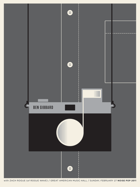
My first port of call for this live D&AD brief will be to look at the speaker in question. I need a better understanding of what he does and what he stands for in order to design a relevant poster for his upcoming lecture.
He works in advertising and is the co-founder of one of the biggest firms in Europe, KesselKramer, and is primarily concerned with the idea over and concept over visual finesse. I need to pay extra attention then in getting the idea spot on before getting too deep into the aesthetic style. He also by the looks of it has a thriving sense of humour and doesn't take himself too seriously so I'll keep that in mind.
There's a ridiculous amount of them out there it seems. You could spend a lot of your life divulging in these morsels of food for thought. Here are are some I find interesting.
'The Communist Manifesto' by Karl Marx and Friedrich Engels (1848). Famous for not working in practice but in theory has some interesting points. "WORKING MEN OF ALL COUNTRIES, UNITE!" The things this spawned are also intriguing to me, mainly the peoples republic of China and the 'red guard'.
'The Little Red Book' quotations from Mao Tse Tung. "In the final analysis, national struggle is a matter of class struggle. Among the whites in the United States, it is only the reactionary ruling circles that oppress the black people. They can in no way represent the workers, farmers, revolutionary intellectuals and other enlightened persons who comprise the overwhelming majority of the white people".
'Stuckism' by Billy Childish and Charles Thompson (1999). 'Against conceptualism, hedonism and the cult of the ego artist'. Makes some interesting statements like 'the stuckist gives up the laborious task of playing games of novelty, shock and gimmick'. Other statements however I whole heartedly disagree with. 'Artists who don't paint aren't artists'.
'The Turner Prize'. This is another manifesto written by the stuckists and again I both agree and disagree with different points. This one hits the nail on the head for me though. 'The only artist who wouldn't be in danger of winning the Turner prize is Turner'.
'Anti Design Festival Manifesto'. This is obviously a postmodernist design manifesto which is trying to inspire people to throw out the rule book for new creative possibilities. I'm not sure about all of it but some elements are interesting. However trying to read it directly from the website is just annoying, they've taken the leading right down into the negatives so that you can hardly make sense of it. Guess they were trying to be radical? Its like trying to make a point to a group of chinese people in punjabi. pointless.
I will...
I will strive to create work both mentally and visually engaging.
I will aim to never claim I know it all.
I will always keep an open mind but have my own informed opinions.
I will always work for the good of people over the good of wealthy pockets.


