What is a Line? Fender & Gibson.


They really are the two most recognized and revered electric guitar makes so it makes sense to concentrate on them.  


Fender:

Fender themselves class there iconic electric guitars as the telecaster and the stratocaster along with two bass guitars which I haven't considered as possible options as they are equally electric and in cases equally iconic.

It has a rich heritage of respected artists that have used there guitars which is how they gained some notoriety.

Other possible guitar for consideration by them is the 'Jaguar' and the 'Mustang'. If I had these with the tele and the strat it gives me a set to work with but it might not offer enough variety.


Fender's visual style keeps strong 60's aesthetics and that of rock and roll. This is obviously a vintage poster but you can see how the modern logo hasn't really changed much in 50 something years. This tells me they are keen to keep their heritage alive and well.


 Gibson:

Gibson guitars as a company is actually very similar to Fender in both it's proud heritage and it's aesthetic choices.

Other Gibson considerations include the 'Firebird', 'SG', 'Flying V' and the 'Explorer'. All have unique shapes. There's also the ES-150. This is the first Gibson electric. 


You can see how similar the logo's are in structure. They are both designed as script text which I suppose is to give the guitars that vintage, hand made feel. The Gibson logo is also written on an angle of about 10 degrees. This style of logo is pretty consistent with the guitar industry, especially those which have been around a while.


What is a Line? Guitar Research.

I thought it sensible to start my research process by looking at some images of iconic guitar shapes and their innards. See what's lurking around the internet firstly.

Fender Stratocaster:


Possibly the most iconic guitar of all time, it's shape is recognised and has been copied countless times. This would make it a prime subject for the idea I have for this brief.

In terms of wiring it's fairly simple and would work well as a simplified graphic.

Gibson Les Paul:


The les paul is probably equally iconic and another one of the most copied guitar shapes of all time. Again the wiring looks simple which is good but this time it seems to involve more chambers. I don't mind this, it gives me more visual elements to work with.

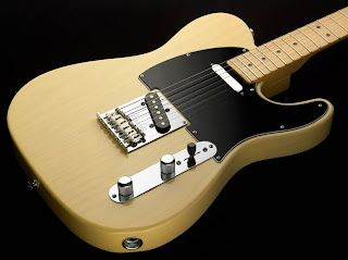
Fender Telecaster:


Another famous model from fender. Not as much as the strat but it's widely known and respected. This is a bit of a mix between the strat and les paul in structure mixing chambers and solid body.

What I'm getting from this is the wiring basically connects the pick ups which transmit the sound from the strings, to the volume and tone switches, that is then connected to the jack output which sends the sound to the amplifier.

Gibson 355:


A Gibson 355 like the ones John Lennon and Chuck Berry played are definitely iconic guitars and will cost you a fortune these days. The difference with this guitar is that it's semi-acoustic so the body is partially hollow but it still uses electrics so it can be amplified.

..........................................................  

Evaluation: 

There's definitely visually interesting elements I can work with so that's a relief. I wasn't sure what was lurking beneath a guitars surface to be honest and whether it would be substantial enough for me to be able to design to. Luckily it has enough bits and bobs to be able to create something interesting.

I need to keep in mind that wiring can be an extremely dull subject to most but hopefully with visual interest added and aimed at the right audience, guitar enthusiasts, I believe it has enough merit to carry the project forward.

Initial thoughts:

The shapes of the guitars are well known enough to my target audience not to need to add detail of the outer elements unless they are visually striking or relevant. This leaves me the whole body of the guitar to map out wiring and chambers with a mind for experimentation in colour. 
 

Lecture. High Culture Vs. Low.

Objective 1: Understand the Avant-Garde.


Dictionary Term – ‘avant-garde’  with terms like
innovation in the arts or pioneers.


The premise of describing artwork which is innovative and pioneering but also to a group doing this. 


So you are either producing avant-garde work (new and innovative) or a member of an avant-garde group.


This has led to brands and companies associating the word avant-garde to themselves in order to lead people into thinking they do are pioneers when in reality they are undisputedly not.


Innovative? Pioneering?
 In the art world at the time movements such as 'Dada' and it's artists like Marhel Duchamp were considered avant-garde in their practice. 


This work 'fountain' (1917) was considered at the time avant-garde because it was something different and new. It matches the criteria placed down for avant-garde but this doesn't necessarily mean that it's any good. 


Objective 2: Question the way art/design education relies on the concept of the avant-garde.


Art and design educational institutes have absorbed this notion of the avant-garde. When you look at course information for the majority of them you can expect to see the words radical, experimental, challenge conventions and so on.

You can even say this is paramount to the course structure for them. It's pushed on young artists and designers that to be good you need to be original, innovative and a breed of creative genius who throws away conventions and trail blazes into new creative pasteurs. 

This premise is what leads to the misunderstood tortured artist stereotype in which the world isn't ready for such radical visionary thinking such as their own. 

Objective 3: Understand the related concept 'art for art's sake'.

By the end of the 19th/early 20th century there was two approaches to the avant-garde.

1.     art that is socially committed [artists being the ‘avant-garde’ of   society, pushing forward political objectives]

2.     art that seeks only to expand / progress what art is (in itself and for itself) / art for art’
s sake.

These guidelines of what was avant-garde and what was not was largely orchestrated by the critics.

Clive bell coined the term 'Significant form' as a way to describe a work of art. This however was one mans opinion and far too simplified for such a broad topic. 

The avant-garde art for arts sake approach dominated most of the 20th century. Work started becoming more and more conceptual.

A major problem for the avant-garde is that it seems to necessitate ‘ELITISM’.

What is Kitsch?

Kitsch is a term used to describe art which is considered to be an inferior worthless copy. For example when a famous work of art like the mona lisa is put onto a mug or badge.

True kitsch work aims to be taken seriously but the subject matter falls very far short. Chocolate box images come to mind which may have been well painted technically but possess no real message or purpose. 

Some artists have played on this by making work look kitsch whilst having a deeper meaning. 


In the modern day these fine artists who are considered avant garde and produce conceptual pieces such as those submitted the turner prize are largely resented. It is still as elitist as ever and considered high culture only by those who consider themselves high culture. The general populous finds it pretentious and slightly offensive that they make so much money off pieces. For example Tracey Emins dirty bed for the turner prize is not seen as artistic to most yet we are told it is by the critics who believe themselves to know better then others and if others don't understand it then it is because they are too stupid to.  


Aesthetics.

1. The Heads Of State - Image for Body + Soul magazine. 

Aesthetically it's safe to say that I find this pleasing. Firstly the mustard yellow on black gives my eyes a strong contrast. Secondly centrally positioned images like this is a composition I always appreciate, something about the focus being bang in the middle is right for me. Thirdly the textures of paint and wood add another element to a piece which could otherwise feel flat. It gives it that organic quality. Lastly the subject matter intrigues me, I love images where they are so simple yet feel like there's so much more to them, like an underlying message I haven't yet discovered, whether that message is meant to be there or one that's personal to me doesn't matter.

2. The Heads of State - Travel Series (Miami).

Same studio but again they do work which I can't help but find visually captivating. Print based media has a soft spot in my heart, whether it's to do with the texture you can get through this or the links with traditional artwork. This still has the use of block graphic shapes used to create an impression of an image which I like. I'm not one for realism really unless it's photography.


3. Henri Matisse - Red Bedroom.

I prefer impressionist and expressionist painters to realists. To me photography killed realist painting and though it can show a lot of skill I think it doesn't realize the true potential of painting. Paintings like this which show a world which we never see, that of another's imagination and vision, is what truly appeals to me.


4. Henri Matisse - Bonheur.

Again Matisse creates a fantasy world which feels like your looking into someones dream. The colour balance is what does it for me on this piece, so many used but manages to keep such a striking harmony.


5. Homer Sykes - Various Works. - http://www.homersykes.com/ All Photographs used copyright of Homer Sykes.

Went to a talk by this guy in the Blenheim studio theater. His early black and white social documentary photography is my kind of stuff. I like photography to capture a moment of human strife or weirdness. The contrast of shadow is why I tend to opt for black and white over colour photography and the shades of grey dominating the image reflect it's subject matter.


6. My taste in sculpture is similar to that of painting, I like the impressionist artists. Distorted figures with harmonious curves. The truth to materials in sculpture is also appealing, the brown stone and metal used feels rich and dense. 
 

Prep Task.

10 things that interest me.

1. Communism/ Red Guard/ Soviet Union.
I've always found this an interesting topic and looking through the manifesto task the communist manifesto is something that I'd like to look into with further depth. The artwork surrounding it has always had that graphic element to it's appearance and feels bold and physical. The history around it also makes for a great depth of source material.

2. Revolution.
Again this stems for the communist research but things like the revolutions in China to turn it into a peoples republic was something real and progressive. It shows a people willing to fight for something and people willing to stand up has always been a source of inspiration.

3. Gig posters.
The artistic nature and marry of art and graphics which you stumble upon in gig posters will always be desirable for me. It's always been there but for this project I was reminded of it when we did the speed dating task.

4. Symbolism.
This actually comes from the first image analysis task. Decoding work with symbolism excites me and the use of it fascinates me.

5. Modernism. 
I sometimes find myself torn between modernist and post modernist work but theres something about simplicity and functionality which does push my buttons. Clean lines and geometric shapes aesthetically please me.


6. Film. 
Watching films is one of my hobbies if you can call it that so the film lectures held my attention more then say fashion as photography. The film noir style 'giallo' from the Italian vernacular cinema lecture was intriguing, the way it was shot focusing on visuals over dialogue appeals to the creative person that I am.

7. Illustration/ Alessandro Gottardo.
Discovered this illustrator through the designer speed dating again. This minimal style with subtle contexts is right down my street, slap a band name and a date on it and you've got a gig poster almost.

8. The Golden/Jazz age.
Think we touched on this during the modernism lecture, the start of the 20th century in respect of it's progression in culture both socialistic and artistic is very interesting to me. That feeling of hope post great war showed the human resilience to trauma, though perhaps it was slightly too eager.

9. Architecture.
Something I've always admired but maybe didn't give it artistic merit where deserved. We spoke a lot about it during the modernism and post-modernism, although in different respects.

10. The divisions within the art community.
This was pretty much the topic for my essay but the essay was obviously focused on art and graphics, but I find the whole begrudging system of class and culture which is handed down to us from those who have gone before leaves a slightly bitter taste in many's mouths. Basically it interests me how these classifications were put in place and how it gave area's of art and design the feeling that they are superior to others.

Knowledge. Student Design Existing Solutions.


studentdesigners.com/

This has a basic principle of you make an account and upload an online portfolio with the idea that students and professionals will see your work. This for me personally doesn't quite do it as a 'student' aimed website and has no real differences to one like say behance which is for professionals.


graphiccompetitions.com/

There's also plenty of websites which just deal with competitions, a bit like a hub where people can post and discover new briefs but again there not particularly exciting or original. It's nothing which involves a community for young designers.


howdesign.com/forum/

Forums show my idea of a design 'community' which isn't just about finish but personal practical and theoretical development as well. However forums have always bored the hell out of me and trawling through visually generic posts has always left me uninspired. Even with the forum presence I think it can be built upon.
 

Copyright 2010. All rights reserved.

RSS Feed. This blog is proudly powered by Blogger and uses Modern Clix, a theme by Rodrigo Galindez. Modern Clix blogger template by Introblogger.