Showing posts with label OUGD406 - The Poster Brief.. Show all posts

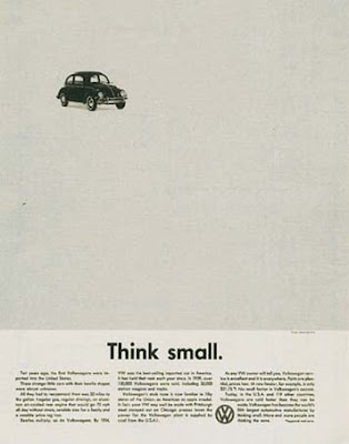
Helmut Krone.

This guy is famous for his work with Volkswagon in the 60's and the kind of style I was thinking of. Simple with a great sense of negative space and atmosphere.


It's brave to use so little elements and for it to work so well. It's clear and unfussy but considered and direct. Clever. I'd like to try and capture this within my posters and focus on not clouding the message with bells and whistles. 

Beach Reference.


Originally when I planned to do the beach illustration I gathered some reference material, things that are iconic of British coastlines. Beach chairs, huts, piers. Due to the timescale I have decided against this concept, I wouldn't of been able to do it justice in the time scale provided and I felt it didn't have that simple clarity the free wash posters have. 

Rain. Existing Design.


I took a look at existing solutions and images around rain to try and gain inspiration and also to see what the common trends are. The answer. Brollies. A lot of the images I found used the umbrella pictogram as a way of showing rain. It looks nice don't get me wrong but by the looks of it another umbrella based image isn't exactly going to set the world on fire. 

Blues and greens played for a strong related colour theme. Generally pastel colours. But again it's been done to death. I guess if it feels right why change it. My final images will dictate colour profiles anyway.

People obviously find something simplistically beautiful in rain and it comes through in their designs. 

Rain. The Positives.

As this brief is designed to make rain look ATTRACTIVE lets see what people have to say on the matter and how others have tackled this.

Quotes:

"A rose must remain in both sunlight and rain or it's lovely promise won't come true."
- rain gives us flowers and life.

"And when it rains on your parade look up rather than down. Without the rain there would be no rainbow".
- rainbows is slightly obvious but visually interesting.

"Criticism, like rain, should be gentle enough to nourish man's growth without destroying it's roots".
- Cheesy I know... but still a pleasant thought. Rain nourishing man. Gentle and life giving. However I still need to keep in mind that humour would be a benefit for this poster and this might not be applicable for this.

"I love the rain, I want the feeling of it on my face".

"Everyone complaining about the rain is just a weatherist bigot".
- I like that. The feeling that rain is discriminated against amuses me.

"Rain is free water"
- Funny because it's true. Could do something tongue in cheek with this.

"I have saved money on sunscreen this year".
- Another comical look at rain and definitely the glass is half full outlook. Visually it could be interesting.

"Free shower. Saves money on waterbills".
- Similar premise which might make it useful for a 3 poster series. 

Erik Kessel.

My first port of call for this live D&AD brief will be to look at the speaker in question. I need a better understanding of what he does and what he stands for in order to design a relevant poster for his upcoming lecture.


He works in advertising and is the co-founder of one of the biggest firms in Europe, KesselKramer, and is primarily concerned with the idea over and concept over visual finesse. I need to pay extra attention then in getting the idea spot on before getting too deep into the aesthetic style. He also by the looks of it has a thriving sense of humour and doesn't take himself too seriously so I'll keep that in mind.
 

Copyright 2010. All rights reserved.

RSS Feed. This blog is proudly powered by Blogger and uses Modern Clix, a theme by Rodrigo Galindez. Modern Clix blogger template by Introblogger.