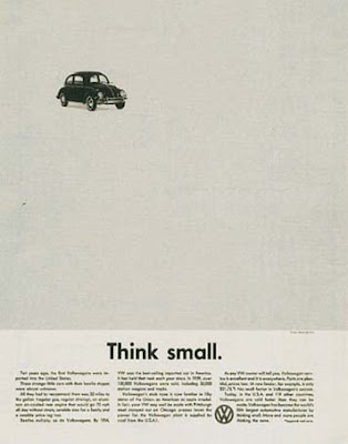
This guy is famous for his work with Volkswagon in the 60's and the kind of style I was thinking of. Simple with a great sense of negative space and atmosphere.
It's brave to use so little elements and for it to work so well. It's clear and unfussy but considered and direct. Clever. I'd like to try and capture this within my posters and focus on not clouding the message with bells and whistles.


Leave your comment